Some thoughts on Android launchers, or, The Need For Spatial Regularity In Touch Interfaces
Sun 13 July 2025
Background
I've used android as my main mobile OS for about four and a half years, and used it previously for about a year and a half before then. In total, I've spent eight and two thirds years on iOS, and six and one third years on Android (so far). Fifteen years (almost to the day!) on smartphones (not counting one dinky little Blackberry not-quite-a-smartphone I had, and 24.5 years carrying a mobile phone of some kind with me, every day.
ADHD oversharing/overspecificity say, "What?!" 😄
While I've tried several different launchers over the years (including the much-touted and incredibly customizable Nova launcher), I always went back to the stock launcher, even the stock AOSP launcher (since I started running AOSP-based Android OSes in 2021). The main reason for this is manifold, but for the most part, the stock launcher hits the sweet spot on the feature-richness/simplicity scale. It successfully avoids a lot of complexity while still allowing a decent amount of customization. Another reason for not sticking with alternate launcher is just the resistance to learning the complexity of a completely new system.
The only launcher I've stuck with for any amount of time is the KISS Launcher, which I daily-drove for probably a year or more, although I'm unclear on exactly how long.
KISS Launcher
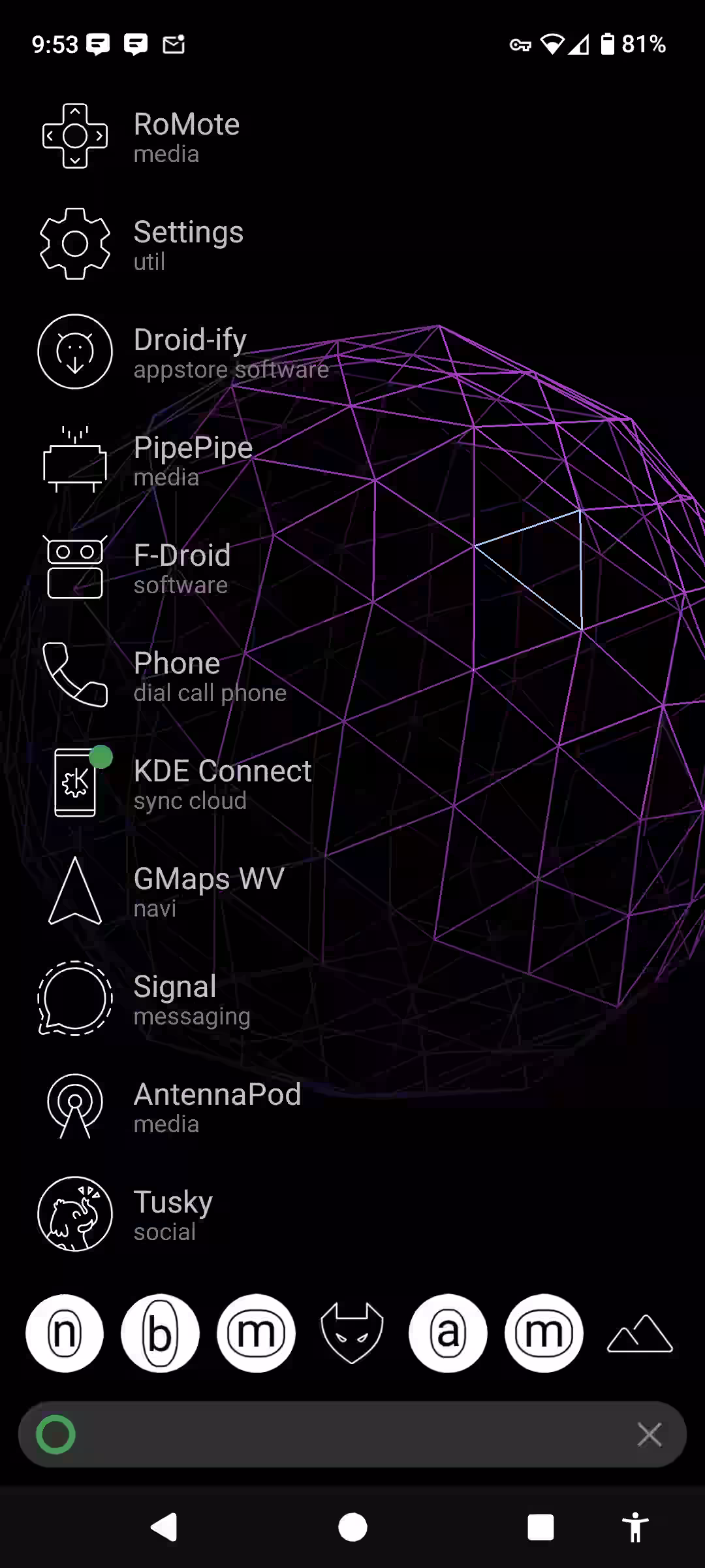
My previous setup with KISS Launcher
KISS Launcher is really made for simplicity. It has only rudimentary support for widgets, and doesn't support placing any icons on the main portion of the screen. You have instead a favorites bar at the bottom similar to the standard icon dock on the default launcher, except that it can store seemingly any number of icons (of course, the icons get smaller as you add more, so there's a reasonable limit of ten or so before they become too small to distinguish or tap reliably). While you give up the option of having icons in the main portion of the screen (what you might call the "desktop," except that mobile OSes don't use a desktop metaphor), you gain a very clean look (just your favorite wallpaper, the search bar, and your favorites icons, and even those can be turned off for a really minimalistic look), and an incredibly powerful and intuitive search and history function.
Where KISS Launcher shines is in learning from your habits. It presents icons according to frequency and/or recency (this is configurable). So when you tap on the wallpaper, you get a list of the dozen or so most recently/frequently-used apps. If you tap on a "folder" called a tag — those are the single-letter icons you can see in the favorites bar — it opens up a list of apps sorted the same way as the main list. So for example the right-most tag on the favorites bar in my screenshot above (apologies if you can't see it, you should switch to a web browser that supports AVIF images!) is Media, which has a lot of apps. Ordinarily, I'd have to scroll through the list of media-related (tagged) apps to find the one I need, but since KISS sorts by frequency/recency, the app I was wanting is almost always in the first screenful of icons.
In all, it's a very powerful (yet simple) and elegant launcher.
So why did I quit using it and go back to "bog standard" QuickStep/AOSP Launcher??
Back to plain jane
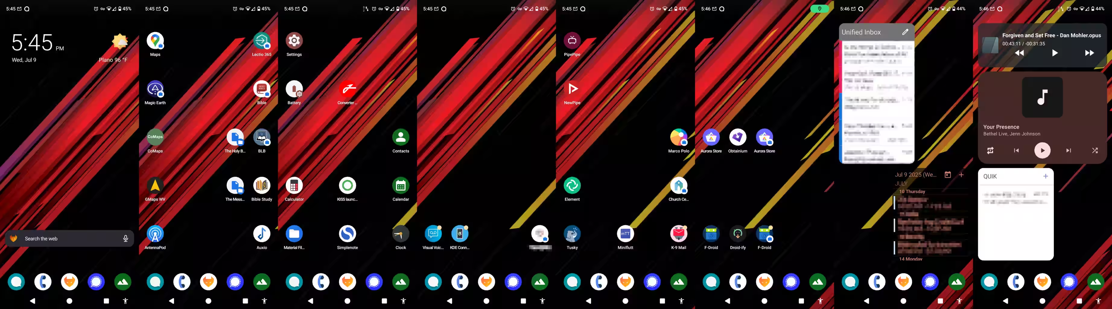
My new setup with QuickStep (the default AOSP launcher)
Having a dynamic, search-oriented launcher that learns from you is awesome. It's like walking into a restaurant that scans your tastes and preferences each time you walk into the door, and prints out a bespoke menu by the time you reach your table that caters to your whims in the moment. But...
But sometimes you just want a burger and fries. Not a bacon burger and fries. Not a burger with a gold leaf-covered bun. Not a burger with truffle oil fries. Just something regular and familiar. KISS' constantly-changing "menu" became a bit chaotic to me after a while. While it excelled in serving my immediate needs, I missed the familiarity of being able to just think, "Ok, top right icon is going to be Tusky," or whatever.
Furthermore, I found myself having to regularly wipe the history for a particular app because I used it too often and wasted time with it. I didn't want to blacklist it from the history — I didn't want it to sink to the very bottom of the listings for all time, I just didn't want it to always be at the very top, being an ever-present temptation to fly around in Luanti or cruise the Fediverse feed on Tusky whenever I got stuck at work. A fedifriend gave me the suggestion of pausing the history, which is a solid suggestion, but it then causes the disadvantages of KISS Launcher to become more prominent, namely, the lack of information density (only getting about a dozen icons per screenful, since it's in a list format).
So, after deliberating back and forth, I went back to the stock launcher on CalyxOS, and set it up more or less the way I had it for years prior...
...aaaaand it was a gigantic mess. Absolutely unusable. It was a jumbled disarray of folders and widgets attempting to be all packed together in a single screen or two. The clutter was anathema to my mind that had been pacified by KISS Launcher's simplicity and quietness.
So, I started over from scratch. I completely abandoned the idea of having folders at all (iOS 3.0 crew say "hey!" lol). I kept the very first screenful as basic as KISS: A single weather widget up top, a search bar, and a favorites bar/dock with a handful of icons.
For my second screenful, I added the most-often-used-for-positive-purposes apps. Navigation. Podcasts and (local) music. Bibles (sorry).
Third screenful, utilities: file manager, settings, calculator, calendar, contacts, clock, SimpleNote, and yes, KISS Launcher is there as a backup because it's easier to search with it than the stock app drawer (I also have KISS set up as the "assistant" app, but I don't launch it that way very often).
Fourth screen is still mostly unpopulated, but it's going to be mostly for work apps, of which there are few in my case (thankfully).
Fifth screen (just far enough away to be a little annoying to get to) are the enjoyable time-wasters: Tusky, NewPipe/PipePipe, but also some other vaguely "social" apps like K-9 Mail (I don't use it very often, to be honest) and Element chat.
Sixth screen is app stores (regularly, but not frequently used), seventh screen is email and calendar widgets, and eighth is media and text messaging widgets.
It probably seems a bit chaotic, to be sure, and I did try looking at alternate launchers, because I'm really wishing there were a simple way to go to "screen #n" than just swiping n times, but overall, I'm liking the new setup. It's kind of a bodged-together attempt at combining the simplicity of KISS with the regularity of QuickStep.
100 Days to Offload 2025 - Day 35
Category: Tech
Tags:
100DaysToOffload
ADHD
Bible
Computing
FOSS (Free and Open Source Software)
Non-religious post
Productivity